
Publishing considerations for the Web
POPULARITY

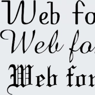
2 episodes with Web typography

2 episodes with Web typography

2 episodes with Web typography

2 episodes with Web typography

2 episodes with Web typography

2 episodes with Web typography

2 episodes with Web typography

Typography enthusiast Oliver Schöndorfer of PimpMyType.com shares his top tips for better web typography so that you can get better website conversion through better typography.In This Episode00:00 - Introduction03:37 - Greeting to Oliver06:41 - Typography is design12:00 - What is a word image15:36 - Feeling and function17:43 - Categories for decision25:18 - Who is the text for28:51 - Three functions of text33:55 - Taking the i l 1 test35:16 - A little history40:06 - Holy trinity of typography42:03 - A guideline for width47:30 - Size for a lot of text51:24 - Headings58:53 - A “Bold” taste1:01:50 - Menu text1:04:19 - Using all capital letters1:07:51 - How many typefaces1:09:53 - How many colors1:13:50 - Accessibility consideration1:17:27 - Emojis and textGet all links, resources and show notes at:https://joshhall.co/173If you're looking to build your online community or membership, I use and recommend Circle!

Oliver Schöndorfer, a UI Designer and Typographer, who helps developers improve their websites through pimped typography joins Ari Koponen on the Frontend Greatness podcast to talk about "Better Web Typography." Oliver's YouTube Channel “Pimp my Type”: http://pimpmytype.com Newsletter with weekly font recommendations for web and app design: https://pimpmytype.com/newsletter In this episode: - How can you make typography on the web better? - Choosing fonts for your next web project - Using variable fonts to improve typography and performance --- Episode Notes Social - Oliver's Twitter: https://twitter.com/glyphe - Pimp My Type: http://pimpmytype.com - Ari's Twitter: https://twitter.com/apkoponen Show Notes - Web Almanac - Fonts: https://almanac.httparchive.org/en/2020/fonts/ - "5 steps to faster web fonts": https://iainbean.com/posts/2021/5-steps-to-faster-web-fonts/ - Prevent Faux Fonts: https://alistapart.com/article/say-no-to-faux-bold/ - Avoid Google Fonts: https://wicki.io/posts/2020-11-goodbye-google-fonts/ - Rasmus Anderssons (@rsms): https://twitter.com/rsms - The "Il1 ag" rule. Oliver's Recommendations - Zack Leatherman: https://twitter.com/zachleat - "Web Typography" by Richard Rutter: https://www.amazon.co.uk/Web-Typography-designing-typography-responsive/dp/099566420X - Typography.guru on YouTube: https://www.youtube.com/typographyguru
Sharing some insight as to what makes a good typography and what doesn’t . And the impact of bad typography on users. --- This episode is sponsored by · Anchor: The easiest way to make a podcast. https://anchor.fm/app --- Send in a voice message: https://anchor.fm/humphrey-pietersen/message Support this podcast: https://anchor.fm/humphrey-pietersen/support
Giving Design Trivia a Kick again. Hope you like it, if you do let me know by commenting and leaving me a message on Twitter @huffypiet --- This episode is sponsored by · Anchor: The easiest way to make a podcast. https://anchor.fm/app --- Send in a voice message: https://anchor.fm/humphrey-pietersen/message Support this podcast: https://anchor.fm/humphrey-pietersen/support

毎週日曜深夜公開のゆるゆるポッドキャスト「純喫茶エピソードvol.439」をお送りします。 今日は、世間より3ヶ月遅れで「あつ森」に参入したcremaが、「人々が集まる場所」として楽しんでいる話や、とたけけさんの音楽設計の素晴らしさなどについて話します。 後半のトピックは、うって変わって書籍「Web Typography」について。ウェブサイト上で文字を扱うすべての人にオススメ!というアレコレについて、語っております。 今夜も、ごゆるりとどうぞ。 関連リンクは、こんな感じです。 あつまれ どうぶつの森 完全攻略本+超カタログ https://amzn.to/2zOd33s <インタビュー>『あつ森』サウンド・ディレクター戸高一生が語る、シリーズにおける音楽の役割とその制作プロセス http://www.billboard-japan.com/d_news/detail/88748 現代で最高のミュージシャンは「とたけけ」である可能性について (翻訳) https://note.com/212akeal/n/n74a5f14d6bbb ウェブタイポグラフィ─美しく効果的でレスポンシブな欧文タイポグラフィの設計 https://www.borndigital.co.jp/book/18440.html

WP 2019 Theme, Hugo 0.50, Google Recaptcha 3.0, Lens and Photos & Static Site Generators Revisited on this weeks Bit v. Byte! If you would like to support me via Anchor Listener Support, go to anchor.fm/bit-v-byte. Thank you! - Wordpress 2019 Theme - https://make.wordpress.org/core/2018/10/16/introducing-twenty-nineteen/ - Google Lens comes to mobile web with Google Images - https://9to5google.com/2018/10/24/google-lens-images-mobile-web-live/ - Google Photos Live Album 10K Limit - https://9to5google.com/2018/10/26/google-photos-live-albums-limit/ - Hugo - https://gohugo.io/news/0.50-relnotes/ - Google Recaptcha v3 - https://developers.google.com/recaptcha/docs/v3 - Rhythm in Web Typography - https://betterwebtype.com/rhythm-in-web-typography - Sublime Merge - https://www.sublimemerge.com/ --- Support this podcast: https://anchor.fm/bit-v-byte/support

Long-time (since 1994) web design practitioner Jason Pamental, author of Responsive Typography from O'Reilly, is Jeffrey Zeldman's guest. For more than an hour, the two designers geek out over responsive typography, the history of type on the web, and the explosive creative potential of the new variable fonts. Multiple Masters. FF Meta. Storing the offsets of the curve points. The three second timeout. Why FOUT is a feature, not a bug. Compensating for the differences between the web font and the backup font. The tragedy of Typecast, the new hope of Figma. Adidas. Nick Sherman. Paula Scher. Mandy Michael. And more. Links for this episode:Hi, I'm Jason | Responsive Web TypographyResponsive Typography: Using Type Well on the Web: Jason Pamental: 9781491907092: Amazon.com: BooksVariable Fonts | Responsive Web TypographyThe evolution of typography with variable fonts: an introduction | Responsive Web TypographyAbout Jason | Responsive Web TypographyJason Pamental (@jpamental) | TwitterVariable Fonts Experiments - a Collection by Mandy Michael on CodePenThe New School: Year One — PentagramDavid Jonathan Ross (@djrrb) | TwitterBello | TypekitAn Event Apart: Orlando 2018 Special Edition Web Design & UX ConferenceFigma: the collaborative interface design tool.Design with web fonts in the browser - TypecastAmbientLightSensor - Web APIs | MDNJason Pamental – MediumJason Pamental on CodePenjpamental (Jason Pamental) · GitHubJason Pamental (@jpamental) • Instagram photos and videosvery able fontsBrought to you by: .TECH Domains (Visit the link and use the code TBWS to get 90% off on 1 & 5 year registrations).
Long-time (since 1994) web design practitioner Jason Pamental, author of Responsive Typography from O’Reilly, is Jeffrey Zeldman’s guest. For more than an hour, the two designers geek out over responsive typography, the history of type on the web, and the explosive creative potential of the new variable fonts. Multiple Masters. FF Meta. Storing the offsets of the curve points. The three second timeout. Why FOUT is a feature, not a bug. Compensating for the differences between the web font and the backup font. The tragedy of Typecast, the new hope of Figma. Adidas. Nick Sherman. Paula Scher. Mandy Michael. And more.
Jason Pamental is the author of Responsive Typography from O'Reilly Media. He recently won one of the Best Of awards for his web typography talk at the annual CSS Dev Conference 2017.
Jason Pamental is the author of *Responsive Typography* from O’Reilly Media. He recently won one of the Best Of awards for his web typography talk at the annual CSS Dev Conference 2017.
Jason Pamental is the author of Responsive Typography from O’Reilly Media. He recently won one of the Best Of awards for his web typography talk at the annual CSS Dev Conference 2017.

Helen is an awesome awesome designer and developer. And guess what? She also does hardware shit! She’s a badass. She currently works at Mozilla on the Firefox browser as a designer on the DevTools. You might have even used it yourself. Links! Helen's Website: http://helenvholmes.com/ Fred the Dragon: https://twitter.com/helenvholmes/status/801077140045316097 Simone Giertz: https://www.youtube.com/watch?v=MOIJnQGspWc Adobe Felix: https://www.adobe.com/products/project-felix.html Performance and Web Typography: https://www.youtube.com/watch?v=emLfXChvVPQ CSS Grid and Grid Highlighter Now in Firefox Developer Edition: https://hacks.mozilla.org/2016/12/css-grid-and-grid-highlighter-now-in-firefox-developer-edition/ New Responsive Design Mode: RDM Lands in Firefox Dev Tools: https://hacks.mozilla.org/2016/11/new-responsive-design-mode-rdm-lands-in-firefox-dev-tools/ This Week in Hardware: https://github.com/helenvholmes/this-week-in-hardware/blob/master/issues/issue-1.md * Johnny-Five: http://johnny-five.io/ Netflix Hardware Projects: http://makeit.netflix.com/ --- Music from https://licensing.jamendo.com/en/track/29866/ambient-m-2003 © Helen Holmes and Jag Talon
Melissa Showalter Art Director at Instrument joins Gary Rozanc to discuss the different roles and job titles at a digital agency such as Art and Creative Director, Technology Director and Developer, and Project Manager. Melissa does in depth about the similarities in print and web typography when compared to modernist design. Melisa also gives advice on what educators can do to help students hit their post graduation life running.
Amanda Buck Designer at Happy Cog joins Gary Rozanc to discuss the need for interactive designers to design in the different context user will view your work in. We also discuss the differences in designing in groups at a digital agency versus students designing for themselves in a class project. Finally, Amanda talks about designers fresh out of school needing to have a much better understanding of how typography works on the web.

On Unfinished Business this week there’s no talk about mugs but Rachel Andrew is back. We’re joined by first timer Richard Rutter to discuss his upcoming book on Web Typography, why he chose to self-publish and fund the project on Kickstarter and the role of a publisher in today’s market. Of course Rachel loves to talk about VAT (irony) so we do that and she explains why she doesn’t actually owe a million Euros to Ireland.

This week on the Boagworld Show we look at how web typography can transform a site and what you need to do to get the most from it.
Jason Santa Maria of Vox Media & A Book Apart discusses his new book, On Web Typography, with host Jeffrey Zeldman. The two designers discuss writing on trains, placing objects and playing with type, the new web designer, designing the Typekit logo, editorial design and Vox Media, three years and two editors, heavenly italics, type classification systems, Dieter Rams and "touch-ability," design as strategy, hitting it with the pretty stick, and more.
Jason Santa Maria of Vox Media & A Book Apart discusses his new book, On Web Typography, with host Jeffrey Zeldman. The two designers discuss writing on trains, placing objects and playing with type, the new web designer, designing the Typekit logo, editorial design and Vox Media, three years and two editors, heavenly italics, type classification systems, Dieter Rams and "touch-ability," design as strategy, hitting it with the pretty stick, and more. Links for this episode:jasonsantamaria.comA Book ApartOn Web TypographyTypedia (a "'wikipedia' for typography" by JSM and friends)TypekitVox Media blogabout Vox Media (Wikipedia)The Verge (a Wikipedia content property)AmtrakMark Simonson's type siteAbout Dieter Rams (Wikipedia)About Good Design (Dieter Rams)On the Typekit logoFonts by type designer Joshua DardenEllen LuptonAmazon.com
In this episode of The Treehouse Show, Nick Pettit (@nickrp) and Jason Seifer (@jseifer) talk about the latest in web design, web development, html5, front end development, and more.

In this episode of The Treehouse Show, Nick Pettit (@nickrp) and Jason Seifer (@jseifer) talk about the latest in web design, web development, html5, front end development, and more.
In this episode of The Treehouse Show, Nick Pettit (@nickrp) and Jason Seifer (@jseifer) talk about Web Typography, CSS Patterns and Simple Icons.
In this episode of The Treehouse Show, Nick Pettit (@nickrp) and Jason Seifer (@jseifer) talk about Web Typography, CSS Patterns and Simple Icons.
Samantha Warren is an experienced designer, speaker, and writer who leverages a diverse background in artistic mediums to create compelling and functional web experiences. Currently, Samantha is the Communications designer at Twitter. She talks about design and the web on her blog, BadAssIdeas.com, and spends time with her cross-eyed cat, Grace.

In this interview, Elliot Jay Stocks explains what he looks for in typefaces and how he evaluates them. He also reveals his favorite fonts and outlines why blindly using CSS techniques are bad.

A proposed specification that would standardize Web-based fonts promises to enable rich typography on the Web. Article link: http://doi.ieeecomputersociety.org/10.1109/MC.2010.178
Even in our day of web videos and podcasts, text is still the king of content on the web. Great typographic sensitivity is one of the hallmarks of sites that exude a professional confidence. From type sizing and coloring to leading, kerning, and measures to proper usage of quotes, dashes, and bullets, to choosing appropriate typefaces, this session will demonstrate using CSS and other modern web technologies to display type on screen with elegance and impact. Jeff Croft is a web designer and developer at Blue Flavor, an experience and design consultancy in Seattle. Beyond his work for Blue Flavor, Jeff is a blogger, speaker, critic, and industry thought leader. Prior to joining Blue Flavor, Jeff was a Senior Designer at World Online, an online journalism outfit responsible for a host of award-winning websites and the place of origin for Django, the Python-based open-source Web framework for perfectionists with deadlines. Jeff has been designing and developing web sites nearly as long as there have been web sites to design and develop. He created his first web page in 1994 and got his first web-related job in 1995. Although Jeff possess many technical skills, his true passion lies in visual design, user interface, communication, and social media. Jeff has recently co-authored two books, Pro CSS Techniques, published by Apress, and Web Standards Creativity, published by Friends of ED. Licensed as Creative Commons Attribution-Share Alike 3.0 (http://creativecommons.org/licenses/by-sa/3.0/).
Have you ever seen a web site so clear, logical, and exquisitely composed it made you stop in your tracks? Have you wondered how the designer achieved such a stunning and cohesive design? In this presentation, Kimberly Elam, designer and author of the best-selling "Geometry of Design" and "Typographic Systems" will reveal the mysterious relationships between proportion, visual systems, composition and aesthetics. Too often excellent conceptual ideas suffer during the process of realization, in large part because the designer did not understand the essential visual principles. This presentation explores these elements and how they work by examining how the use of visual principles informs, even creates, beauty in typographic design, but, more importantly, how you can use these techniques to create cohesiveness in your own design. The wide range of visual examples are both informative and insightful, and any designer can benefit from learning or revisiting the rules governing the basics of typographic design. Kimberly Elam is a writer, educator, and graphic designer. She is currently the Chair of the Graphic & Interactive Communication Department at the Ringling College of Art + Design, Sarasota, Florida, where she has developed an academic minor in the Business of Art and Design. Her first book, Expressive Typography - Word as Image, identifies and analyzes methods by which words can transcend didactic meaning and become images. Geometry of Design - Studies in Proportion and Composition, visually illustrates the connection between classic proportioning systems and modern graphic design, industrial design, illustration, and architecture. Grid Systems - Principles of Organizing Type puts forth a clear methodology for understanding and learning the grid system of composition. Her most recent book, Typographic Systems - Rules for Organizing Type presents an innovative series of nontraditional, rule-based, visual language systems for typographic composition. Her current work focuses on the development of a series of innovative ebooks and print-on-demand books for design education on her website, StudioResourceInc.com. Licensed as Creative Commons Attribution-Share Alike 3.0 (http://creativecommons.org/licenses/by-sa/3.0/).
© 2020-2026 Ivy Podcast Discovery LLC
